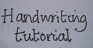
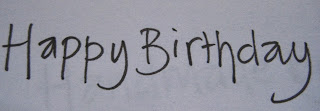
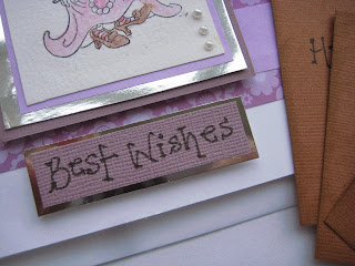
So first things first, choose a fine line pen or a gel pen that has free flowing ink. This technique does not work so well with a biro. My favourite pens are Papermate Tikky graphic by Rotring. Bloke bought them for me one Christmas and I haven't gone back.
First of all write your message in your normal handwriting. You may find that some letters you join and others you don't. The key to a great handwritten font is consistency so if you do a different 'a' or 'e' you need to stick to that style.
Next try that phrase by not joining at all and concentrating on even spaces between letters but keep it pacey to gain flow.
Now using the phrase add a dot to the ends of the letters. Instant card message font.
The next one follows the same principles.
Write the phrase with spaces between the letters then...
Add a little line dash to the ends. This can be varied and you can have all your dashes flowing in the same direction or they can always come from the left or right of the letter or right across the ends as in the 'H' shown. Again choose one style and stick to it for the entire phrase.
Another thing you can do to vary your font is to experiment with working below the written baseline like this...
Note that H goes below the line, and I and A are in the air, the P's are different lengths. To tidy this up...
Add the dots - it looks informal and fun and the inconsistency of not writing on a straight line doesn't show up.
You can use these in lots of different ways.
So what are you waiting for? Grab a pen and a piece of paper and get squiggling. Jo x


Jo what a fabulous post - love it - thanks. I struggle with my handwriting as it starts out neat and tidy but can go into a scrawl when I am rushing. I have found that I also write differently on separate days - goodness knows why as it is not a conscious thing - your tutorial was lovely as it is clear and really made sense. Will be looking for one of the pens Jo, have a wonderful Sunday and thanks as always for a fun and informative post. Big hugs to you
ReplyDeleteDorothy
:-)xxxxxxxxxxxxxxxxxxx
Thanks for a great tutorial, Jo! From time to time I have tried to fiddle with my handwriting with some interesting results, but I especially appreciate your observations and suggestions which might help me produce results that please me [and others :] more.
ReplyDeleteGracie xx
What a great thing to show us Jo, thank you! Your printing is very neat and stylish even without the added 'squiggles' - beautiful! I appreciate the link for the pens too - I have a set of 'Rotrings' from arty days but different to these.
ReplyDeleteJoy x
What fun! I've never seen anything like this - big thanks! I'm off to grab a pen and paper...Chrissie x
ReplyDeleteWhat a great post Jo!! I would struggle as my handwriting is far from neat these days. Yours is lovely and love the sweet tags in the last photo. Xo
ReplyDeleteThanks for all these fab ideas, Jo - I always seem to just go for the "add dots" font, but these look really lovely. Going to grab my pen and practise!
ReplyDeleteHappy new week,
xx
Very effective! I have the messiest handwriting so I'll take any advice on ways to improve it. x
ReplyDeleteYou have beautiful hand-writing :)
ReplyDeleteI might have to abandon my excuse of being lefthanded for my poor handwriting. What a fun tutorial this is; I'm going to try some of these techniques. My handwriting can only get better. May I ask, where did you learn about these ideas? Thanks again!
ReplyDeleteScrapbooking classes mainly and I have a great book on hand lettering called 'Hand lettering made easy, by Debra Beagle. Which I won in a scrapbook class raffle. Thanks for your comments. xx
DeleteWhat a fun tutorial.... I love it ! I always wanted to write my own labels but I don't feel like I have very nice handwriting. But after your tutorial I think I'm going to give it a try :) thx.
ReplyDelete