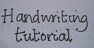
So first things first, choose a fine line pen or a gel pen that has free flowing ink. This technique does not work so well with a biro. My favourite pens are Papermate Tikky graphic by Rotring. Bloke bought them for me one Christmas and I haven't gone back.
First of all write your message in your normal handwriting. You may find that some letters you join and others you don't. The key to a great handwritten font is consistency so if you do a different 'a' or 'e' you need to stick to that style.
Next try that phrase by not joining at all and concentrating on even spaces between letters but keep it pacey to gain flow.
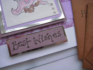
Now using the phrase add a dot to the ends of the letters. Instant card message font.
The next one follows the same principles.
Write the phrase with spaces between the letters then...
Add a little line dash to the ends. This can be varied and you can have all your dashes flowing in the same direction or they can always come from the left or right of the letter or right across the ends as in the 'H' shown. Again choose one style and stick to it for the entire phrase.
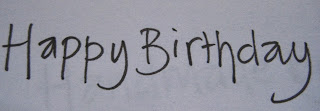
Another thing you can do to vary your font is to experiment with working below the written baseline like this...
Note that H goes below the line, and I and A are in the air, the P's are different lengths. To tidy this up...
Add the dots - it looks informal and fun and the inconsistency of not writing on a straight line doesn't show up.
You can use these in lots of different ways.
So what are you waiting for? Grab a pen and a piece of paper and get squiggling. Jo x


